Describe the feeling through visible choices
Begin with the experience you want the image to create, then translate it into things a reviewer can see. “A safe place becoming unfamiliar” might lead to familiar rounded shapes, a restrained palette and one increasingly sharp shadow. This is more actionable than a sequence of adjectives such as cinematic, magical and premium.
For a fictional library on a moving island, decide whether the buildings feel carefully maintained or improvised. That decision affects materials, edges, signs and the way characters handle objects. Keep the story reason next to the visual instruction.
Choose rules that survive different scenes
Specify shape language, colour relationships, lighting behaviour and texture separately. A rule should be clear enough to test across a close-up and a wide shot. “Use one warm accent to identify the librarian” can remain useful when the location or time of day changes.
Distinguish a permanent rule from a scene exception. A night sequence may require a darker value range while preserving the same character silhouette. If every scene becomes an exception, revisit the rule instead of expecting collaborators to infer the real intention.
Attach a reason and a rejection condition
References are easier to use when you explain what to borrow from each. You might value the composition of one image and the material texture of another without wanting either image copied wholesale. Describe the relevant quality in plain language.
This fictional brief makes the review criteria explicit and keeps the visual choices tied to readability.
| Element | Direction | Reject when |
|---|---|---|
| Librarian silhouette | Compact body with a large square satchel. | Satchel disappears into the body shape. |
| Library materials | Worn painted wood with repaired corners. | Surfaces look newly manufactured or glossy. |
| Accent colour | Amber marks the character and important clues. | Background objects compete with the clue. |
Test the brief before expanding the world
Choose a scene that contains a character, a key prop and a representative background. Review whether the main action remains readable at the size people will actually watch. An image may satisfy the palette while failing because the focal point is lost.
Collect disagreements as decisions to clarify in the brief. If one reviewer prioritises soft lighting and another prioritises crisp silhouettes, identify where the tradeoff should land. Save an accepted reference and a rejected example with a short explanation so later reviews do not restart the same debate.
Wrong Opera’s captured Style Lab shows an Art-direction brief, separate Do and Don’t lists, a locked state and an Unlock to edit control. Below these, Compare directions takes labelled style candidates. Write a rule as something visible in the same test shot: a warm rim light, a restrained palette or a specific shape language. Avoid asking one candidate to solve a completely different composition.
Before changing a locked brief, list the shots already judged against it and decide which must be reviewed again. The sample interface warns that changing direction affects styled shots. That warning identifies a dependency; it is not a measured estimate of your rerender cost. Keep the earlier brief and rejection reasons in your project record.
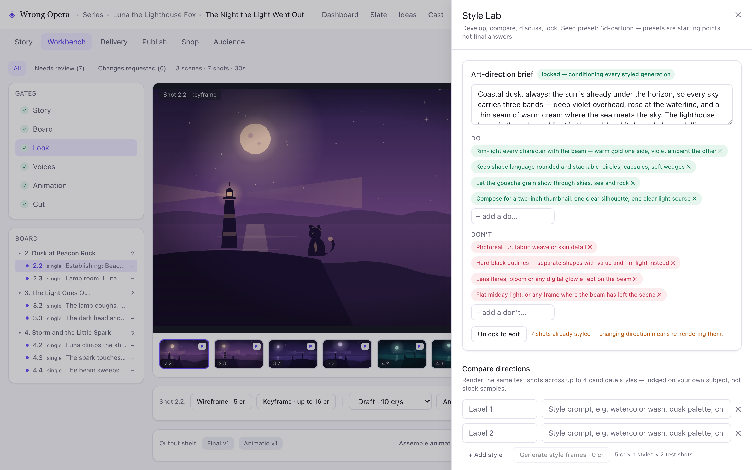
Style Lab displays the sample art-direction rules and lock state. Its Compare directions controls make an explicit, repeatable visual choice possible.
Real product interface captured 7 September 2026, using fictional built-in demo data. Approval notes and balances are sample data. Any animation or final-cut playback shown uses still-image fixtures, not a measured production result.
Open full-size product screen ↗Questions & answers
How many references should I include?
Use enough to explain the distinct decisions, then remove images that repeat or contradict one another. Each reference should have a stated purpose.
Should I specify every colour value?
Specify exact values when consistency depends on them. For early direction, relationships such as warm character against cool environment may be more useful than an extensive palette without context.
Explore the workflow with your own idea.